<input>
<input> is used to create interactive input controls that allow users to input and edit single-line text.
This feature requires the client to add additional dependencies. Please refer to More Elements for the integration method.
Usage
Basic
Below is a basic usage example of the <input> component:
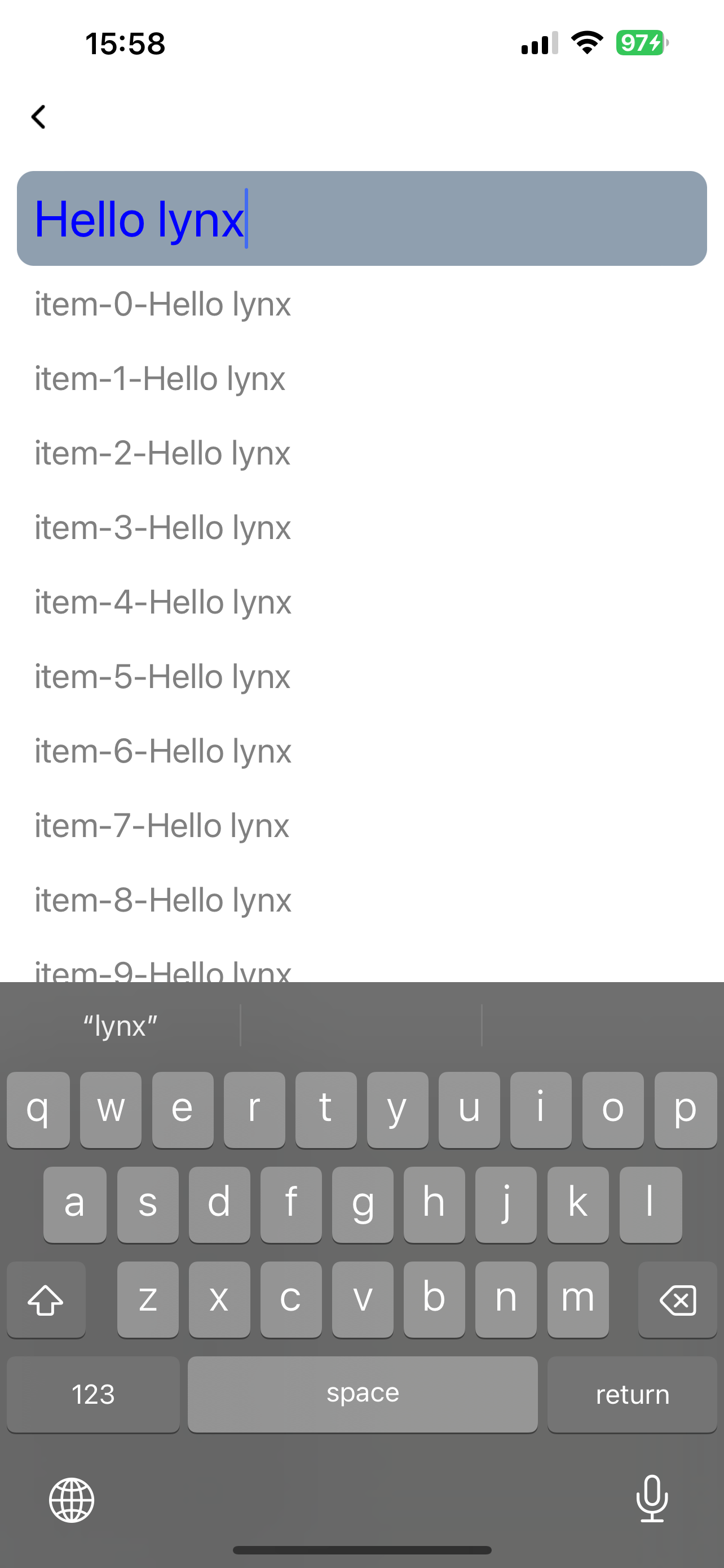
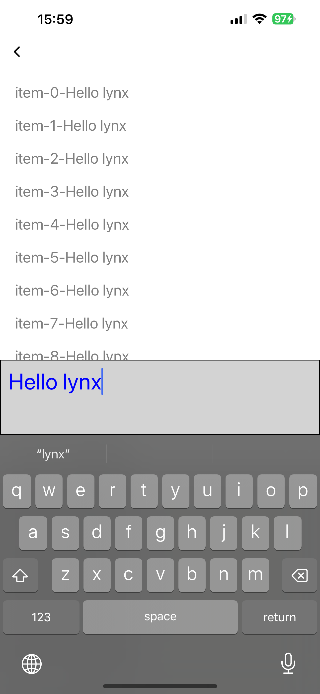
Keyboard Avoidance
<input> doesn't automatically avoid keyboards, but you can adjust its position by listening to keyboard events and modifying its position accordingly:
Attributes
android-fullscreen-mode
Android only
3.4
Whether to enter the full-screen input mode when in landscape screen, in which the keyboard and input box will take up the entire screen
confirm-type
Android only
iOS only
Harmony only
3.4
The type of confirm button
disabled
Android only
iOS only
Harmony only
3.5
Interaction enabled
input-filter
Android only
iOS only
Harmony only
3.4
Filter the input content and process it in the form of regular expressions
ios-auto-correct
iOS only
3.4
Auto correct input content on iOS
ios-spell-check
iOS only
3.4
Check spelling issue on iOS
maxlength
Android only
iOS only
Harmony only
3.4
Max input length
placeholder
Android only
iOS only
Harmony only
3.4
Placeholder
readonly
Android only
iOS only
Harmony only
3.4
Readonly
show-soft-input-on-focus
Android only
iOS only
Harmony only
3.4
Show soft input keyboard while focused
type
Android only
iOS only
Harmony only
3.4
Input content type
Events
Frontend can bind corresponding event callbacks to listen for runtime behaviors of the element, as shown below.
bindblur
Android only
iOS only
Harmony only
3.4
| Field | Type | Optional | Default | Platforms | Since | Description |
|---|---|---|---|---|---|---|
| value | string | No | – | Android only iOS only Harmony only 3.4 | 3.4 | Input content |
Blurred
bindconfirm
Android only
iOS only
Harmony only
3.4
| Field | Type | Optional | Default | Platforms | Since | Description |
|---|---|---|---|---|---|---|
| value | string | No | – | Android only iOS only Harmony only 3.4 | 3.4 | Input content |
Confirm button clicked
bindfocus
Android only
iOS only
Harmony only
3.4
| Field | Type | Optional | Default | Platforms | Since | Description |
|---|---|---|---|---|---|---|
| value | string | No | – | Android only iOS only Harmony only 3.4 | 3.4 | Input content |
Focused
bindinput
Android only
iOS only
Harmony only
3.4
| Field | Type | Optional | Default | Platforms | Since | Description |
|---|---|---|---|---|---|---|
| isComposing | boolean | Yes | – | Android only iOS only Harmony only 3.4 | 3.4 | Is composing or not |
| selectionEnd | number | No | – | Android only iOS only Harmony only 3.4 | 3.4 | The end position of the selection |
| selectionStart | number | No | – | Android only iOS only Harmony only 3.4 | 3.4 | The start position of the selection |
| value | string | No | – | Android only iOS only Harmony only 3.4 | 3.4 | Input content |
Input content changed
bindselection
Android only
iOS only
Harmony only
3.4
| Field | Type | Optional | Default | Platforms | Since | Description |
|---|---|---|---|---|---|---|
| selectionEnd | number | No | – | Android only iOS only Harmony only 3.4 | 3.4 | The end position of the selection |
| selectionStart | number | No | – | Android only iOS only Harmony only 3.4 | 3.4 | The start position of the selection |
Input selection changed
Methods
Frontend can invoke component methods via the SelectorQuery API.
blur
Android only
iOS only
Harmony only
3.4
Release focus
focus
Android only
iOS only
Harmony only
3.4
Require focus
getValue
Android only
iOS only
Harmony only
3.4
Get input content
setSelectionRange
Android only
iOS only
Harmony only
3.4
Set selection range
setValue
Android only
iOS only
Harmony only
3.4
Set input content
Compatibility
LCD tables only load in the browser